felicia the Photographer
felicia The photographer
Categories
Beautiful Wedding Invitations by Basic Invite // Brand Review
Jul 3, 2018
Beautiful Wedding Invitations by Basic Invite // Brand Review
If you’re looking for gorgeous designs, textural variety, and color options galore, look no further. Basic Invite impressed me not only with their multitude of designs – (over 800 different Wedding Invitation sets alone!) but with the sheer variety of customizations ranging from 180 different color customizations on the invitations themselves, 40 different envelope choices, multiple gold leaf options, raised ink, etc. etc. They truly have it all, and an extremely user friendly website to boot. And if you needed more incentive to use them, they offer FREE wedding websites that coordinate with their invitation designs. They’re incredible! Below are a few of the different options I ordered to review. I tried to run the gamut with the variety of colors, textures and materials I ordered to really provide you with a comprehensive review of their invitation offerings. ** Don’t miss the discount code at the very end of this blog post!
So here we go with the Basic Invite Brand Review:
The Buying Guide
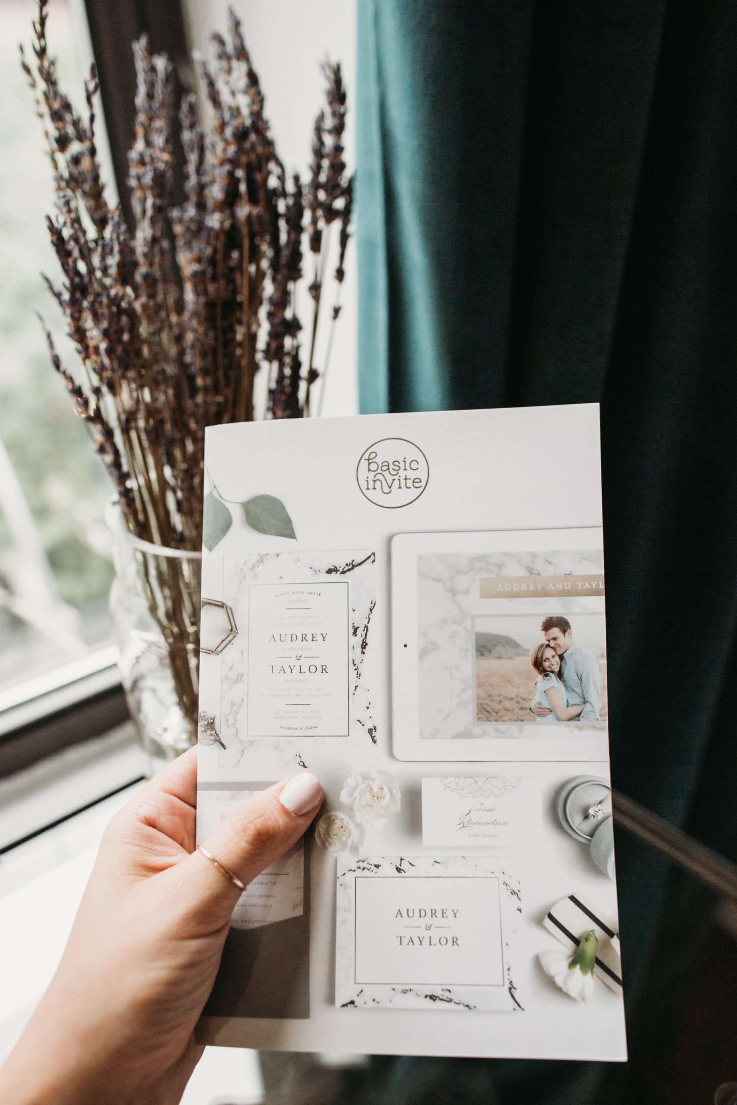
There’s something incredibly helpful about feeling a product. Basic Invite was great because not only was I able to order CUSTOM samples of anything I was curious about, but they also included a buying guide with my order. In that catalogue they showcased the many customizable options in a visual way that was super helpful!
Extras
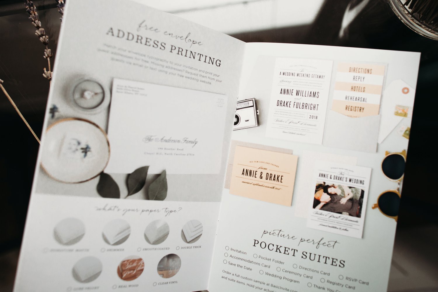
Free Envelope Address Printing
Free. As in, included, time saving, hand saving, uniformity. YES PLEASE.
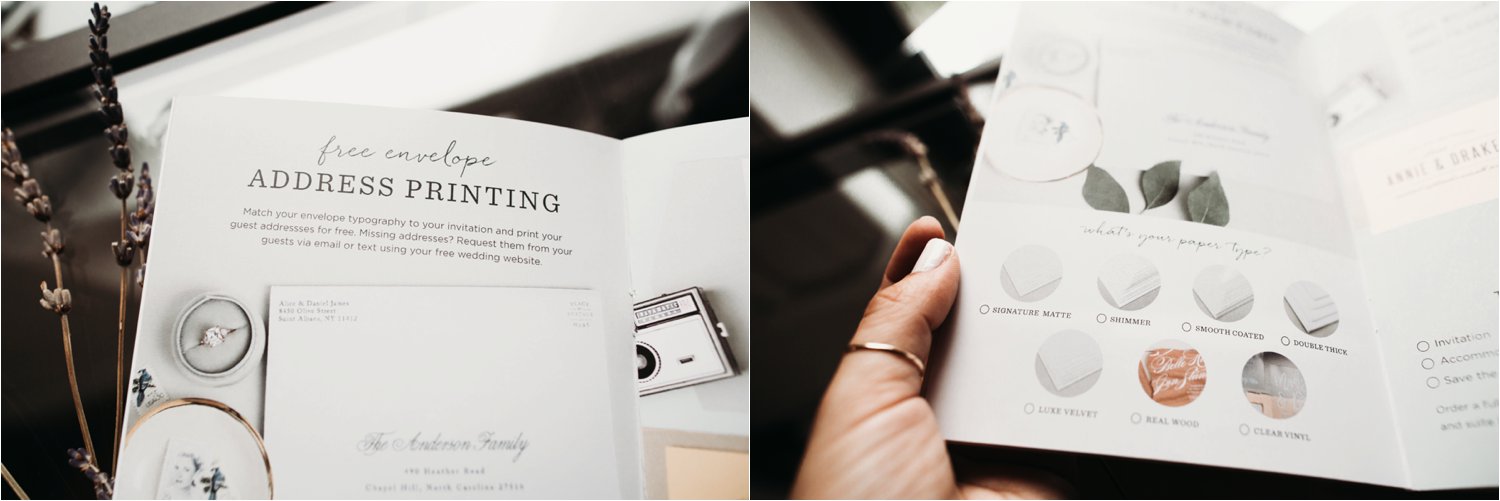
7 Different Paper Types
As depicted below they offer a signature matte, shimmer, smooth coated, and double thick papers as well as a luxe velvet finish, real wood or clear vinyl materials. We’ll get to these later, because holy wow is the vinyl a dream!
Customization
180 different colors to choose from. Wow. Gone are the days of feeling like you have to keep looking because the red is too fire engine and not enough brick! Something I had never seen before was the true color customization of the designs. It’s not just the typefaces and main elements. I was able to change different parts of a water color design to look exactly as I preferred.
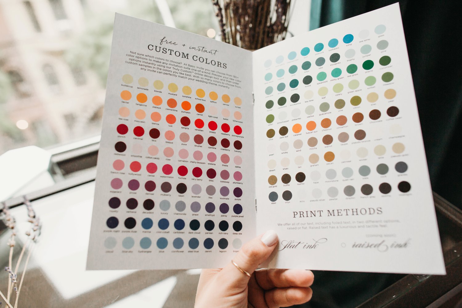
Golf Leaf x3
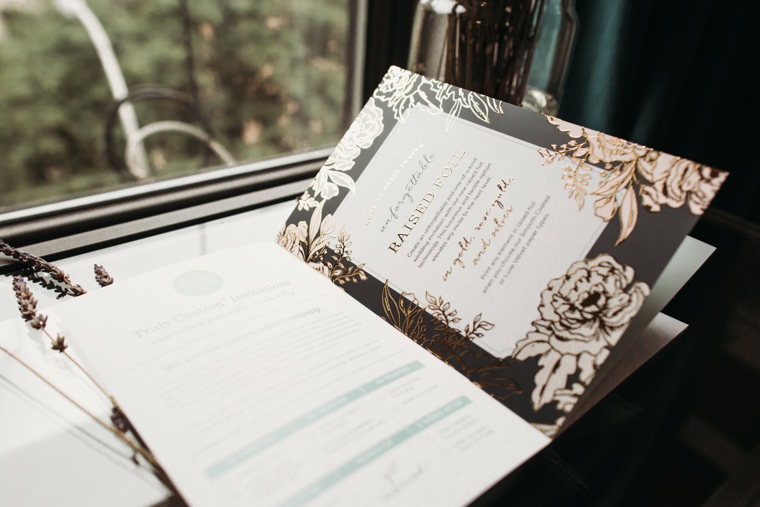
I can never get enough of a good metallic. Something unique to Basic Invite is that they not only offer gold, but they also have silver AND wait for it…. rose gold gold leaf options. All the heart eyes, I mean come on!

Raised Foil
Round two with the excitement. Experiential designs are so impactful and I love that these details weren’t limited to ink colors but that the leafing could be raised as well!
Luxe Touches
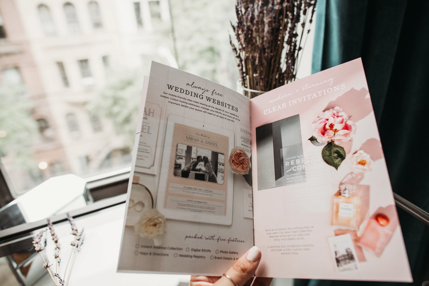
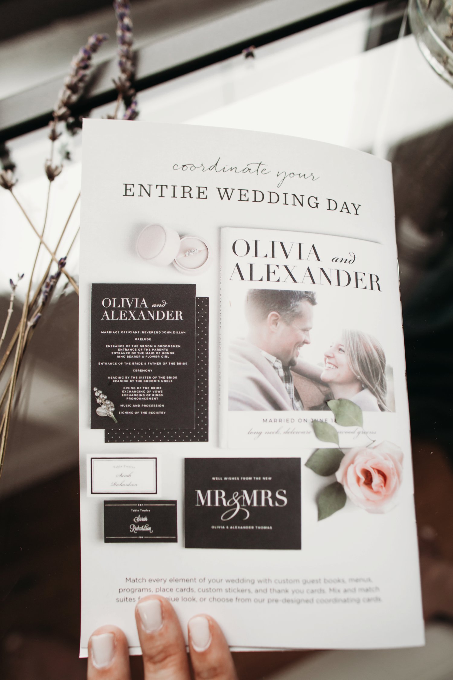
Combining all of the customizations with a free and matching wedding website is amazing. With Basic Invite your Save the dates, Invitation Suite, place cards, website, thank you cards, etc. can all match your wedding aesthetic. As a photographer telling a visual story, I love how cohesive and refined that is!
My Samples
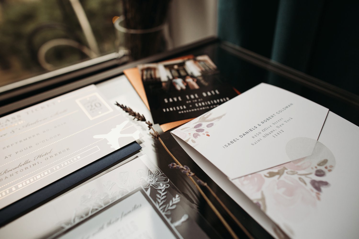
As I mentioned, I really wanted to experience the many options Basic Invite offers. I wanted to see what the different paper textures felt like, how they handled printing images, what the gold leaf looked like, how flimsy the vinyl invites might be, and on and on. I’ll take you through each of the below designs, what I was looking for, and how I was impressed by them for separate reasons. Enjoy!
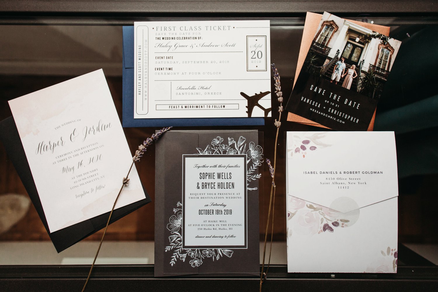
Save The Date Magnets
I always love a Save the Date magnet. It’s a great way to ensure your guests keep track of your reminder and it becomes practical to do so! Some magnets are too weak to hold anything besides themselves. That wasn’t the case with these. They were sturdy, slick, and the printed image turned out beautifully- true to color and sharp.
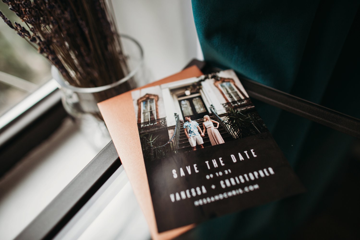

Pro tip: Select an envelope color that compliments the image you use as your save the date. It adds a touch of elegance that your guests won’t quite be able to put their finger on… well, figuratively speaking! 😉
Design Details:
Style: Museum Muse Save The Dates
Paper Option: Magnet
Trim Option: Square
Envelope Color: Mojave Shimmer
The Vinyl Invite
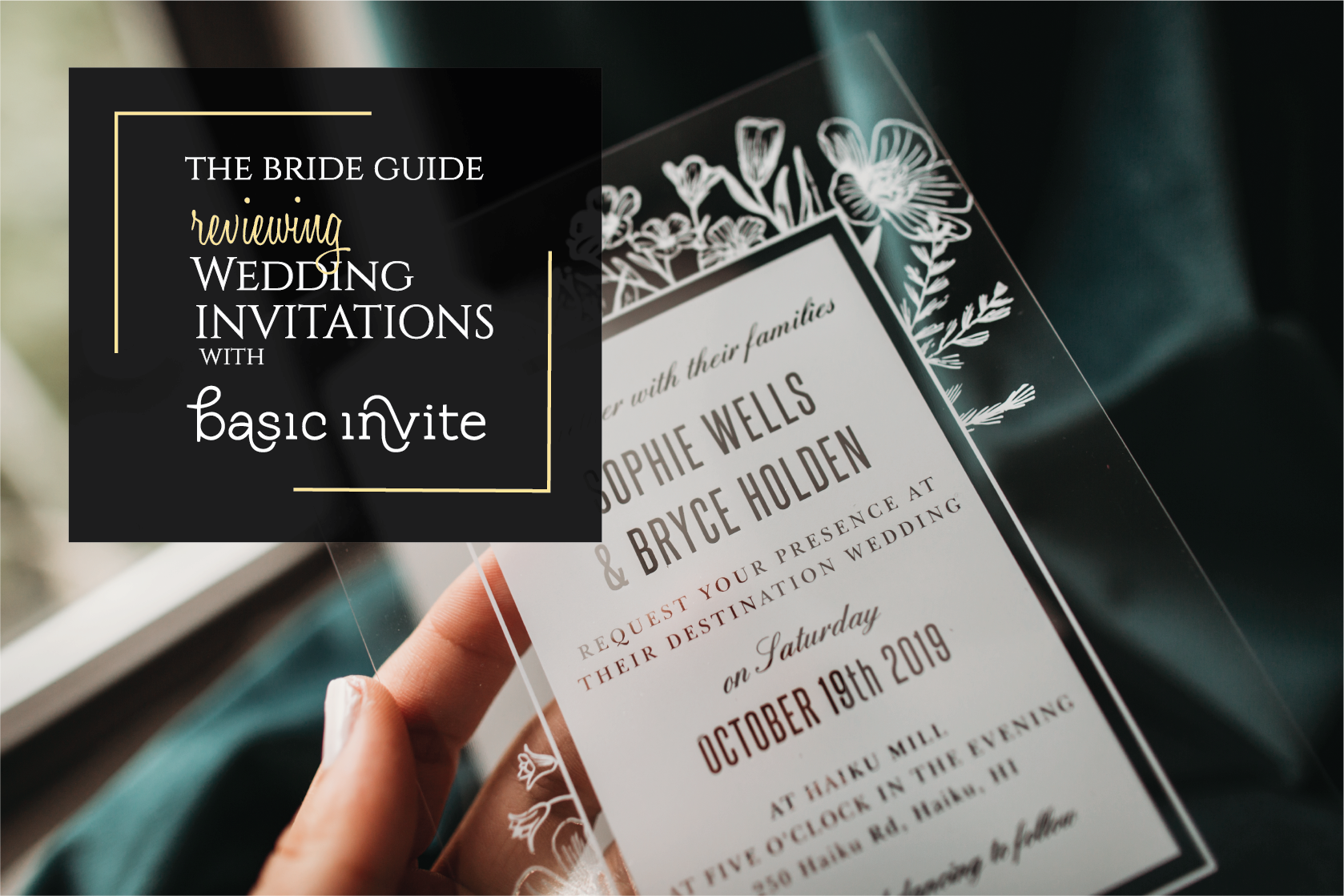
I LOVE acrylic. Half of my home decor is acrylic, but like anything I think it packs the best punch when used in moderation. I suggest using it as the wow factor for your wedding invitation itself, rather than using it for both your Save the Dates as well as the invite.
There were several ‘clear designs’ to choose from, I opted for this floral pattern to accentuate the wedding venue: Haiku Mill. If you aren’t familiar with this venue and still need a destination wedding location in Hawaii, you must consider this fabulous spot!
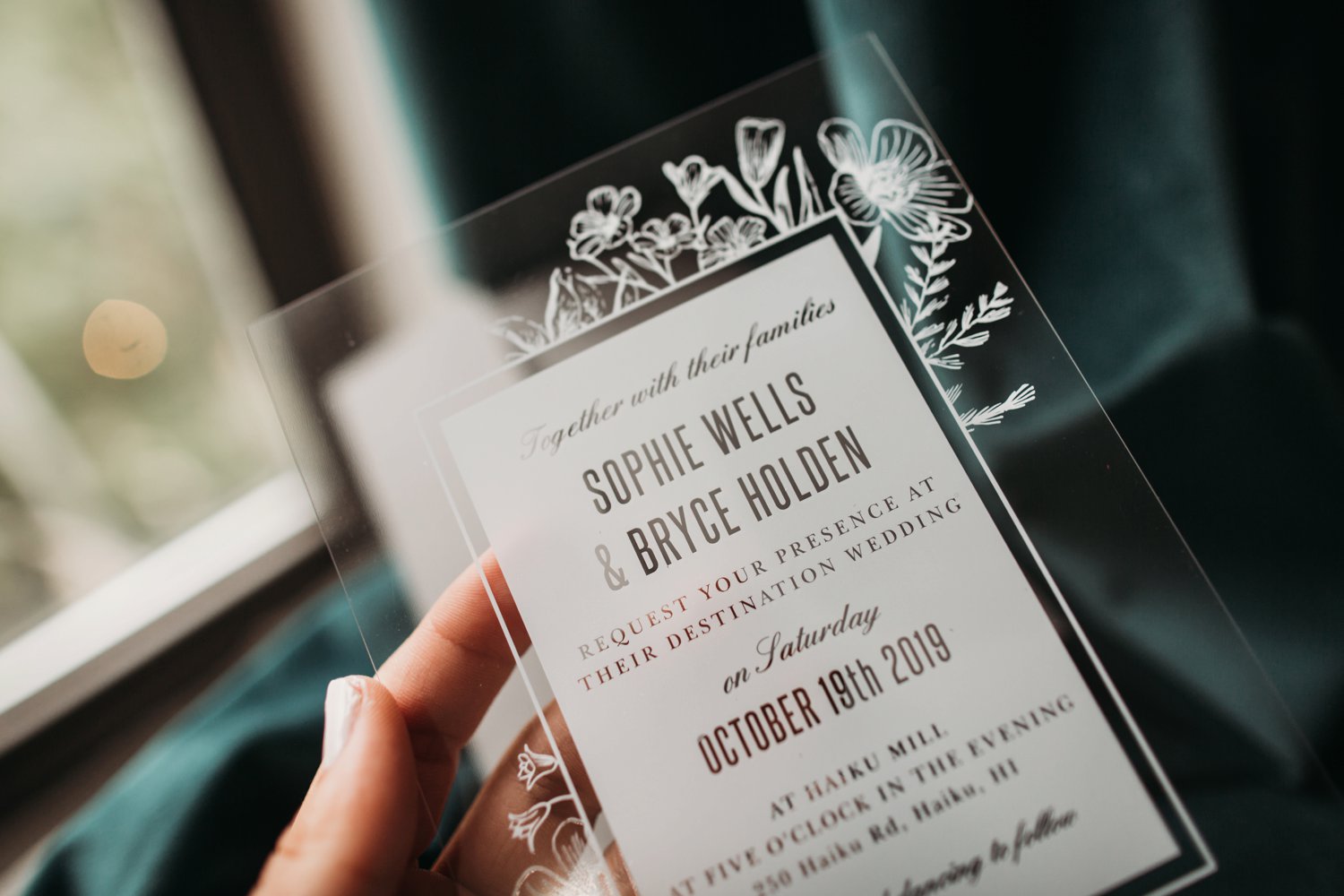
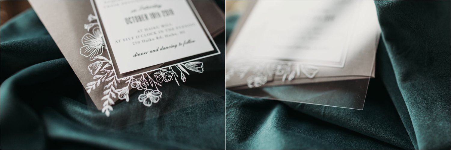
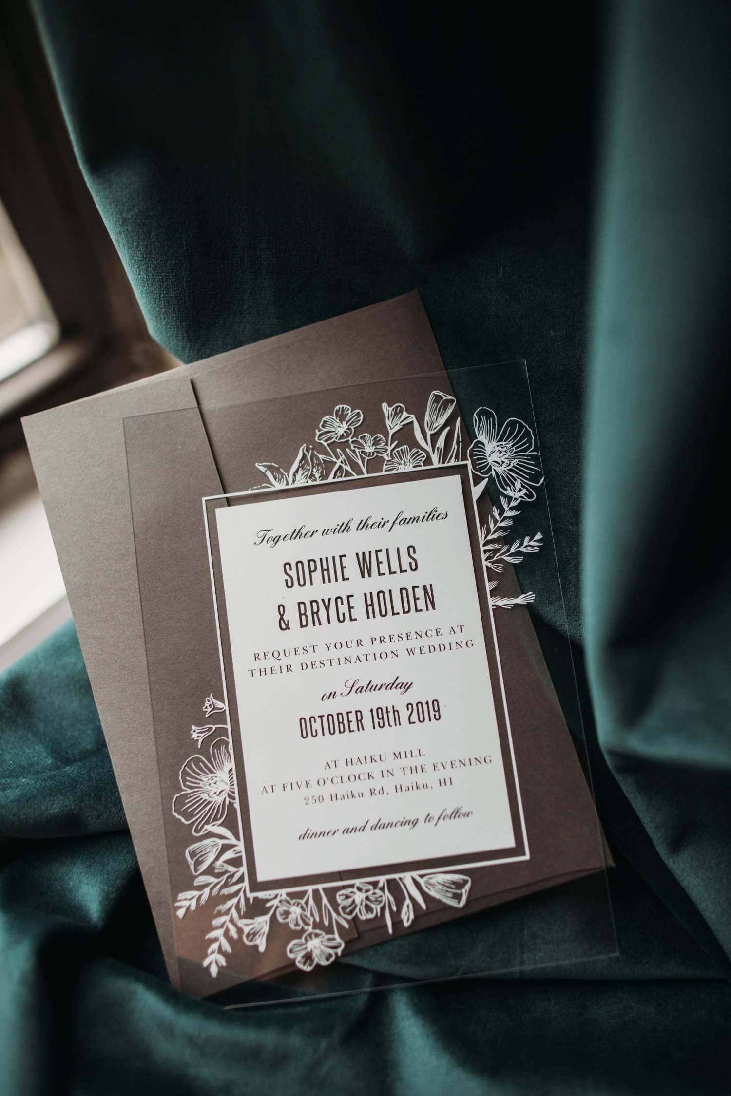
Pro Tip: If you opt for the gorgeous clear invitation look, be sure to select a dark envelope that coordinates with your wedding scheme to provide contrast so that your guests can easily read the white lettering.
Design Details:
Style: Museum Muse Save The Dates
Paper Option: Magnet
Trim Option: Square
Envelope Color: Mojave Shimmer
Watercolor Invitations on Shimmer Paper
This subtle beauty was on my favorites list from the very beginning. I love the soft blush colors (although you could customize it to any color) and paired with the script on shimmer paper I knew I had to see it IRL.
I featured Long Island City’s The Foundry on this invitation. It’s a stunning urban industrial venue with both indoor and outdoor space. Combined with soft linens, florals, and candle light, it’s a romantic dream!
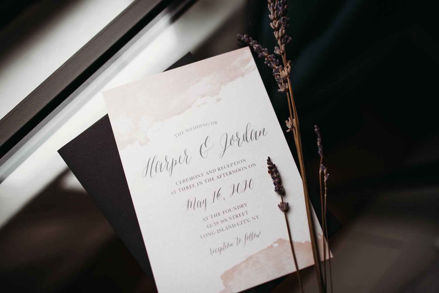
Basic Invite truly has your best interest at heart. They sent me this style in the shimmer paper as requested as well as a plain white paper so that I could compare!
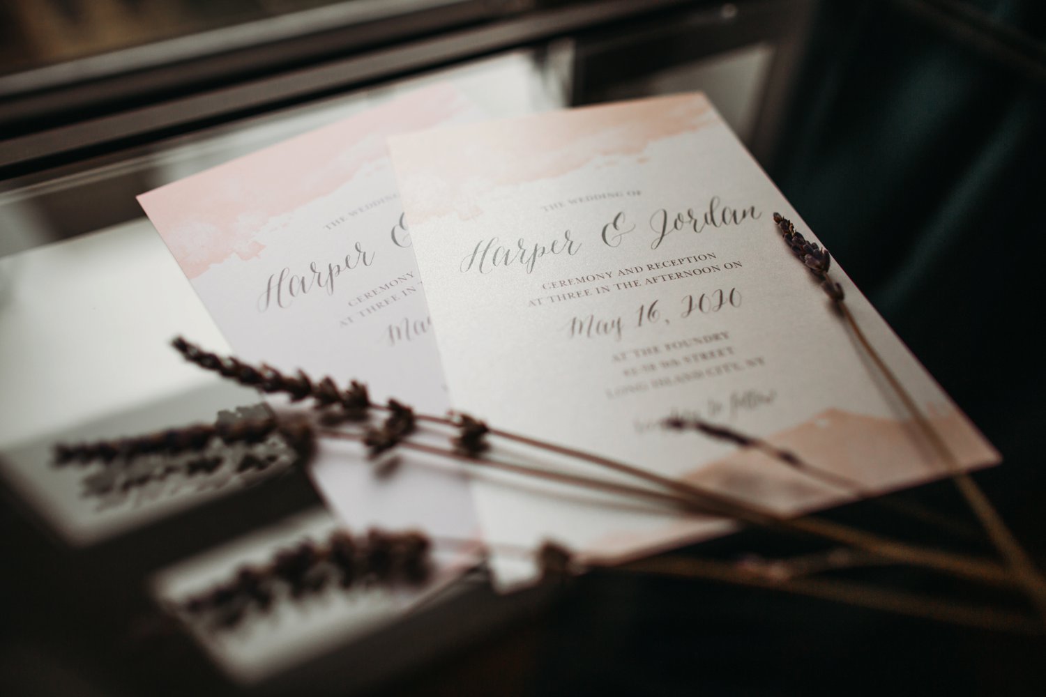
Pro tip: Subtle designs exude elegance. Remember with the right touches, less is always more! A simple invitation with a bold envelope offers an incredibly classy look!
Design Details:
Style: Dip Dye Wedding Invitation
Paper Option: (right) Premium Shimmer
Paper Option: (right) Signature Matte
Trim Option: Square
Envelope Color: Black
The Destination Wedding Ticket Invitation
We’ve all seen them, but to be frank, I’ve never seen one styled quite so elegantly! The scripts and the subtle bits of gold leafing are just the sort of elements to get your guests excited for your beautiful wedding at Rocabella Hotel in Santorini, Greece!
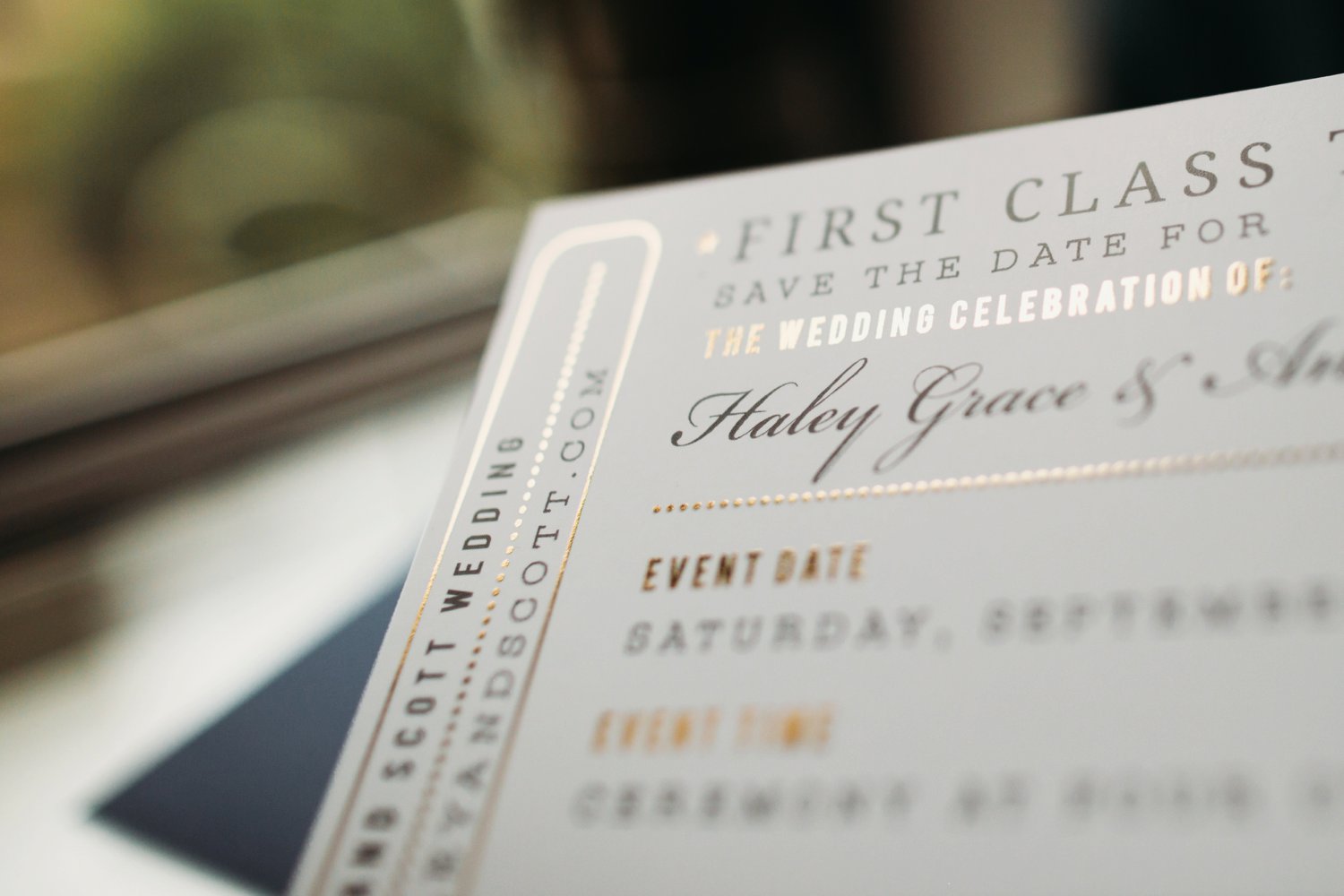
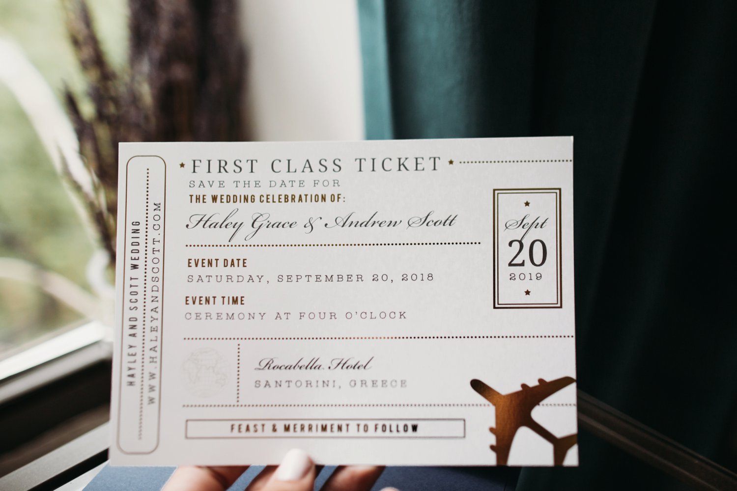
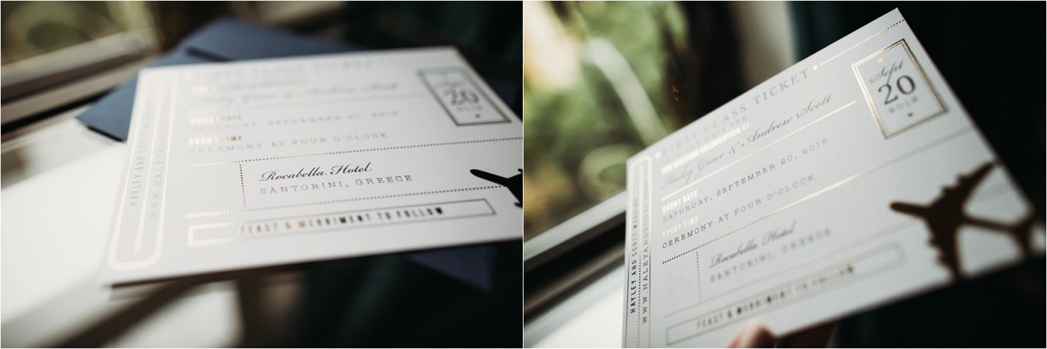
Pro tip: When styling your destination wedding save the dates, use colors that are signature to your destination to help your guests imagine the beautiful atmosphere.
Design Details:
Style: Bon Voyage Foil Wedding Invitations
Foil Type: Flat
Paper Option: Smooth Coated
Trim Option: Square
Envelope Color: Persian
Seal & Send Wedding Invitations
This is something I hadn’t seen, but as a fan of efficiency, I love it! These Invitations are all in one. Their unique design allows your guest to detach the RSVP post card from the bottom of the open invitation! So clever!
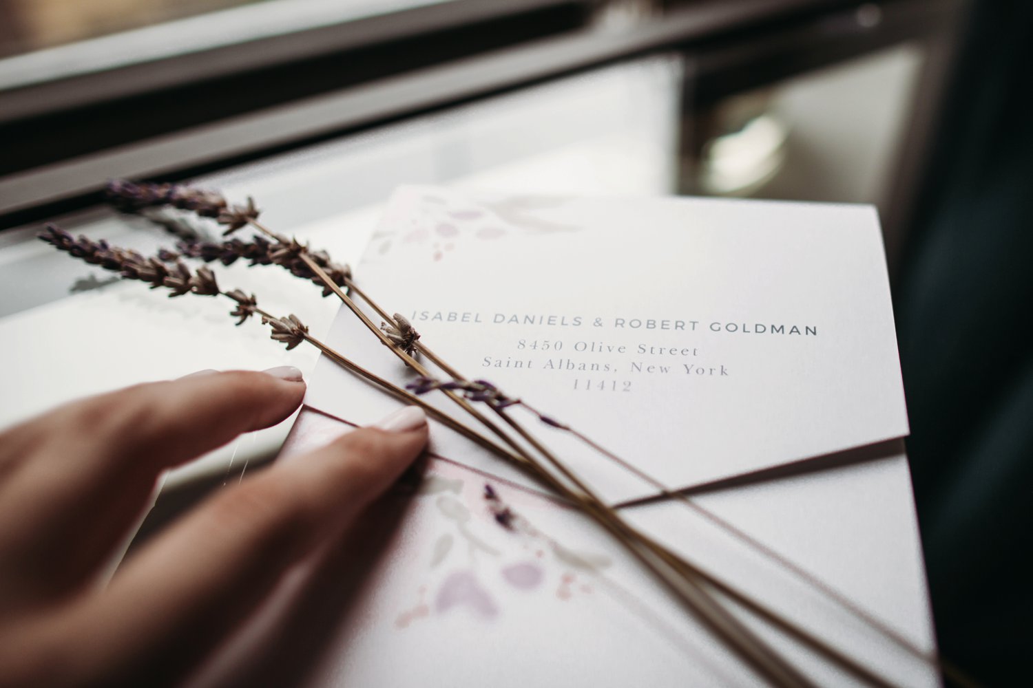
If there’s one thing I learned about Basic Invite, it’s that they LOVE options. They even sent options I didn’t request– incredible! Below are two examples of the sticker closures they offer for the Seal & Send Invitations. You could also purchase them to embellish your envelope.
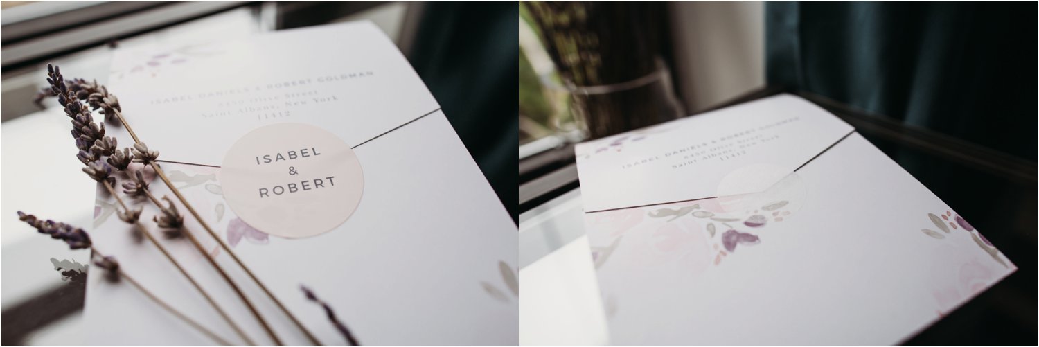
This watercolor style was provided by Basic Invite, but I actually was able to customize all of the colors in the water color design. I’m still amazed that’s an option!
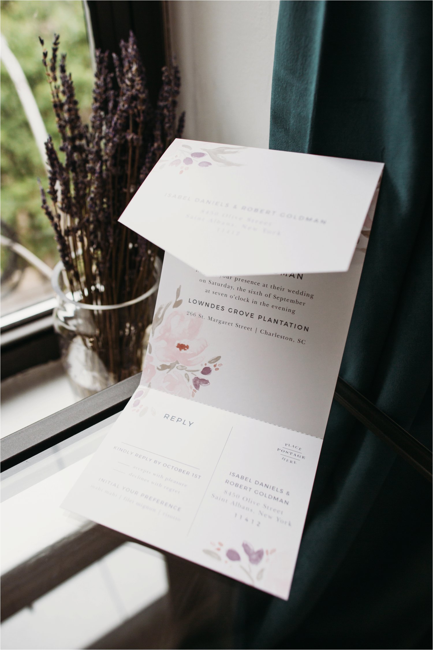
These colors and this floral design would be a perfect fit for a domestic destination wedding in the south. Specifically I thought they would perfectly compliment a wedding at Lowndes Grove Plantation in Charleston, South Carolina. The open air, all white, plantation venue is such a stunner! If you’re unfamiliar, it’s worth a gander!
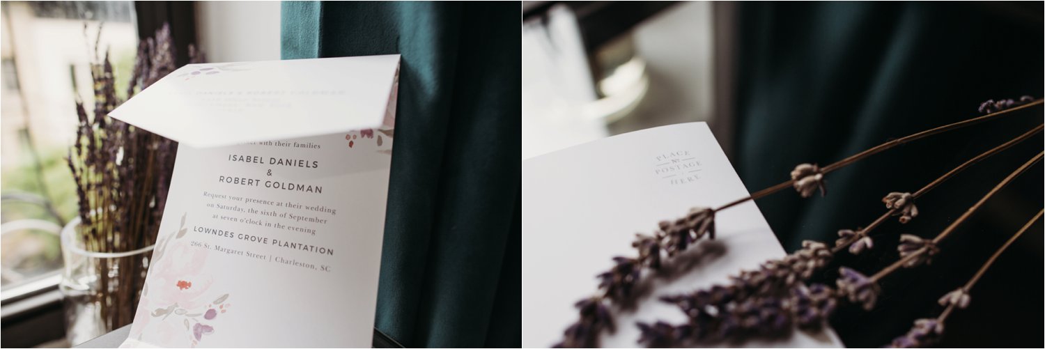
Pro Tip: Your RSVP card is a great place showcase a peek of your personality and the mood of your day. Ask your guests a fun question, like: ‘What song will get you on the dance floor?’
Design Details:
Style: Watercolor Bouquet Seal and Send Invitation
Paper Option: Smooth Coated
Sticker Option: Designer’s Choice
Trim Option: Seal and Send
Envelope Color: *No Envelope
Recap: The 10 Reasons You Should Order Your Wedding Invitations from Basic Invite
1 — They’re beyond customizable.
2 — Paper and material choices galore
3 — Beautiful Designs
4 — FREE & matching Wedding Websites
5 — 40 envelope colors
6 — 180 design colors for customization
7 — Super user friendly website
8 — FREE engelope addressing
9 — 3 different gold leaf options
10 — Raised ink
If I didn’t already spell it out, I think Basic Invite is a great option for wedding invitations. They’re affordable, incredibly custom, and truly beautiful! As always, the above reflects my own opinions. This is not a paid advertisement.
>>> Click Here to shop BASIC INVITE’s Invitation Collection <<<
More from the Bride Guide:
Why You Should Bring Your Own Photographer to Your Destination Wedding
10 Tips for Perfect Wedding Photos

LEave a comment: